- Marketer Gems
- Posts
- marketing teardown: 👹📦 chaos packaging
marketing teardown: 👹📦 chaos packaging
packaging that breaks your frame. literally do a double take.
Tom Snyder
October 24, 2024
In partnership with
howdy, marketer!
coffee in a tube? tampons in an ice cream carton?
chaos packaging: you know it when you see it.
it makes you do a double take. breaks your frame. makes you think “who put that there?”
until you realize – that’s what they were going for.
in this week’s deep dive, I’m tackling a new phenomenon called chaos packaging.

today's treasure trove
advertisement
2025 Prediction: A Surge of Self-Serve CTV Buyers

Roku predicts 2025 will be a big year for self-serve CTV
Roku Ads Manager makes CTV advertising easy
Target your audience, optimize campaigns, and drive performance
what is chaos packaging?
don’t sweat it if you haven’t heard this term before, it’s quite fresh and there’s still not many brands doing it.
essentially, chaos packaging is using packaging as a marketing play to make the product significantly stand out from the crowd.
using packaging as an attention grabber is nothing new:
think how rxbar put their ingredients list in huge font on the front of the package
how apple has incredibly designed packaging that actually showcases their products as you open them
or how the many d2c foam mattress brands ship a huge mattress in a mind-bogglingly tiny box
and hey, remember boxed water?
beyond big fonts and beautiful unboxing experiences, chaos packaging isn’t “optimizing the packaging experience” – it’s actually fitting a square peg into a round hole.
it’s taking a different packaging system in a well-known form factor and applying it to a completely different product.
why chaos packaging?
we as marketers know that having a great product is not enough to succeed in this world.
marketing is just as, if not more, important in a product’s success, and packaging is simply one vehicle to communicate a message.
packaging is often reduced to the simplest and least expensive options – a completely utilitarian perspective.
but, in a world with so many things vying for our attention, packaging is an avenue for physical products to provide an analog “scroll-stopping” experience.
for physical products, packaging is a necessity – so why not make it unique? especially if the brand is young and doesn’t have resources to put towards paid marketing channels.
when a young brand is put directly on the shelf next to a legacy brand, it needs to have some way to grab attention and communicate its message before the customer chooses the tried-and-true option.
advertisement
|
stellar examples of chaos packaging
flo organic tampons
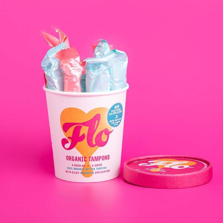
flo is becoming one of the poster children of chaos packaging.
they’re a female hygiene product, so they’re already a little taboo in many societies
they’ve packaged their product like ice cream
check it out, they could’ve put their product in any box – all they needed was a cardboard container. the ice-cream carton is a well-known shape and size, so seeing one in a hygiene aisle immediately breaks a customer’s brain.
and, next to any unilever box, this definitely grabs attention.
departed spirits
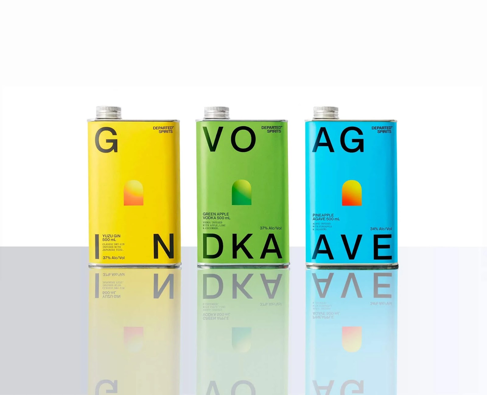
ever step into a liquor store?
you’ll see aisles of glass bottles in essentially only two colors – a sea of sameness.
and then…motor oil?
departed spirits also took recognizable shape and material and put it where it doesn’t belong.
motor oil is not safe to drink so it really begs the question of why it would be next to consumable liquids.
in this case, the packaging and branding and very striking – something this brand can do because they aren’t following the traditional path of a glass jug with a paper label around it.
vacation® classic whip sunscreen

yes, it’s sunscreen. and yes, it 100% looks like whipped cream.
unlike the other brands, vacation® isn’t a pure-play company with one product – instead, they have one theme: poolside in the 1990s
this is one of those “strong” brands (that I absolutely love), whose essence is based on a meme. years ago, i discovered poolside.fm (now, poolsuite.net) – the vaporwave radio experience. (yeah, very much like the pit viper website I recently covered)
oshun electrolyte concentrate

a sleek pump bottle you might expect to see in a swanky cocktail bar’s restroom – buuuut, it’s for rehydrating.
pump oshun directly into your glass to drink.
I love this example because it has that same shock factor I see in the others, but it also looks beautiful – instead of the obnoxiously bright colors this type of product typically comes in.
when perusing through the grocery aisle, of course this one looks out of place, but it also gives me a “rather see this on my kitchen counter every day” vibe.
wrap up
chaos packaging is primarily seen in physical retail goods (so far) and must break the customer’s brain to stand out among the competition.
the best examples are food items packaged like toxic materials or vice versa – this adds even more to the shock factor.
chaos packaging can be a powerful marketing tool for physical goods that need packaging but can’t afford paid promotion. (plus some earned media if done really well!)
thanks for reading this far and I’d love to hear if you have a favorite shocking example of chaos packaging – just reply directly to this email 😀
✌️,
tom from marketer gems

what did you think of this edition of marketer gems? |